top of page
Google Data Analytics Capstone Project.
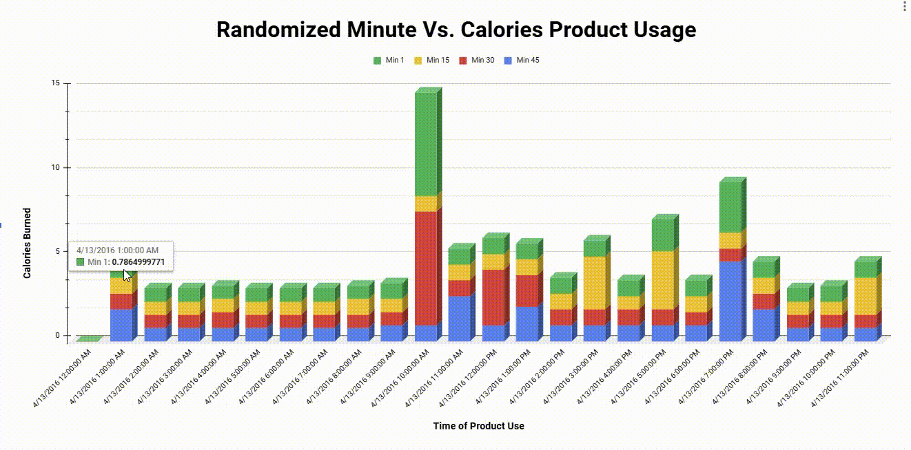
Image 1) This chart depicts a randomized sample of activity from different minutes of an hour. It demonstrates that the 1st minute of each hour generally burns the most calories from user to user, suggesting that signal cues are most common at the beginning of every hour.
The Context.
To complete Google's Data Analytics Certification, I was tasked with selecting a data set and analyze it to derive
real-world business insight from raw, messy data. I settled on a dataset from a company called "Bellabeat," a startup that specializes in wearable health technology.
The Problem.
While Bellabeat has already established themselves as a big competitor in the wearable-technology space, the company is exploring ways to grow their market value and userbase.
The Solution.
Given the data provided from Bellabeat's fitness tracker, I used Google Sheet's integrated visualizer software to model and analyze several attributes of user data points.
The Outcome.
After cleaning over 1,300,000 data points, I demonstrated that user activity was greatest during the late mornings and afternoons, implying activity reminders should be implemented during the early periods of each day.
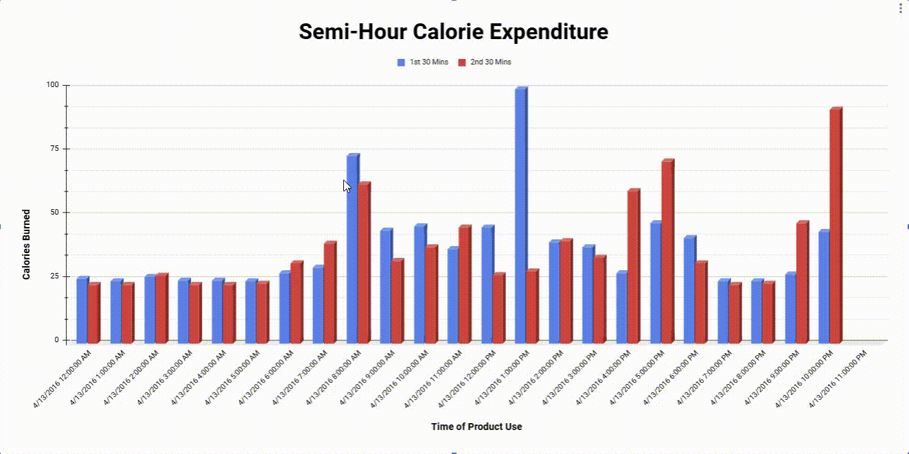
Image 2) This graph displays the difference between the first 30 mins of each hour of the day to the second 30 mins of each hour of the day. There is no significant different/pattern between each time period.
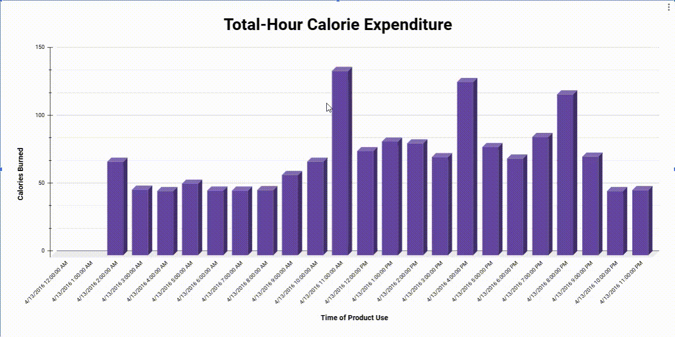
Image 3) The visual above supports the idea that activity is most common during the late mornings and evenings.
bottom of page